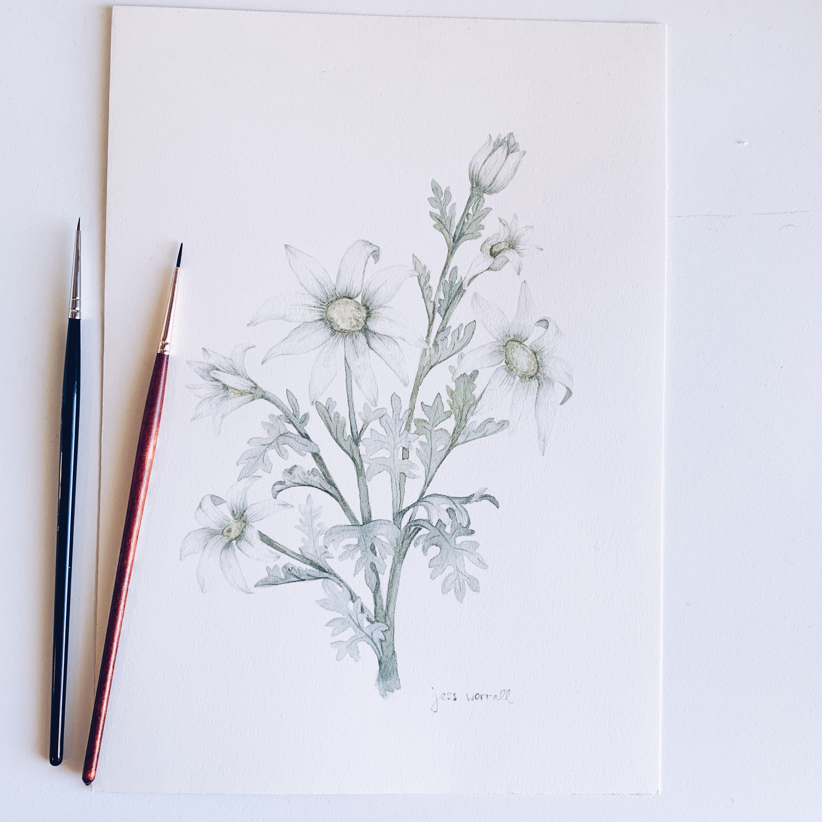
Process: Creating an Illustrated Alphabet Series
For those of you who followed along with my alphabet challenge last year, this post is to give you a bit of an insider’s peek into how I did it. How I created those pieces from a concept to finished artwork. This is my personal experience with my own creative practice.
I started this project as a year-long process, thinking of it as a body of work that was achievable for where my life was at (a mum juggling building a creative career and business with a toddler), but also as a challenge to keep continuously drawing through the year (otherwise, I tended to go from high flow moments of creativity to low flow moments). The challenge I was facing was procrastination. I often feel overwhelmed by too many ideas or not enough of them and no idea where to start. So, I created this project to avoid all those struggles throughout the year. This was aimed to keep me motivated by having the idea and concept ready to go.
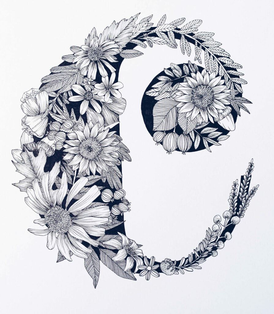
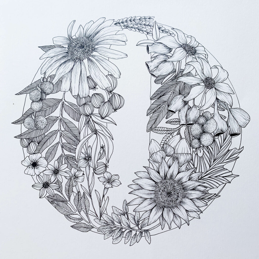
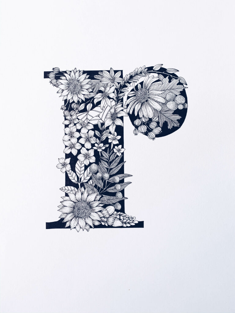
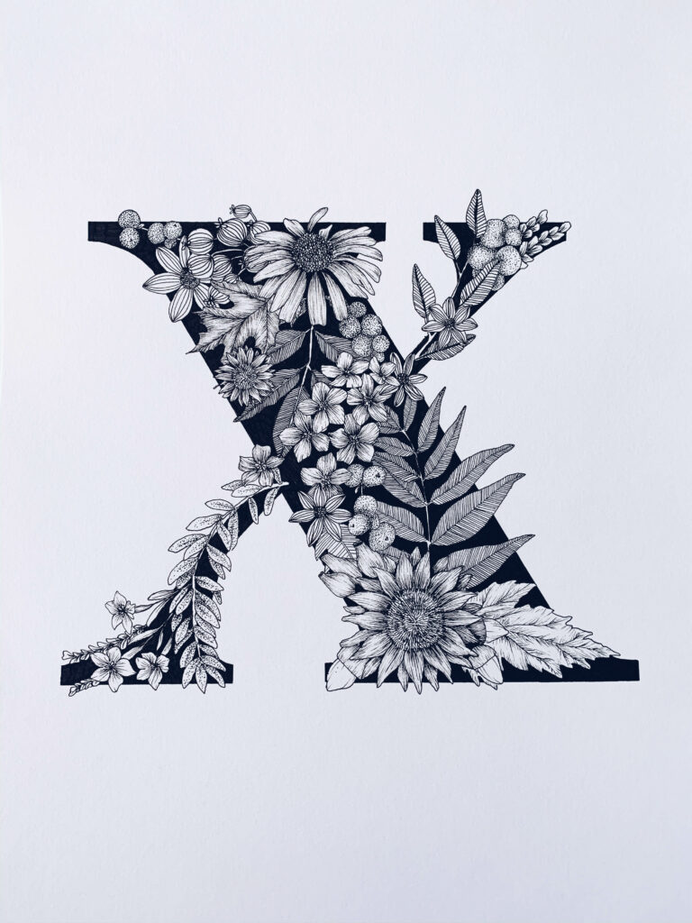
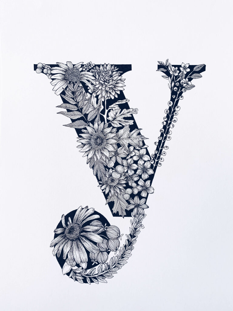
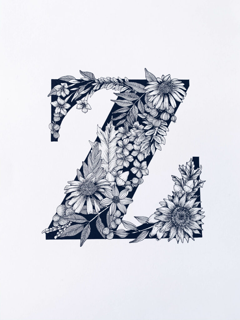
My inspiration for the floral alphabet was (and always is) nature. I love nature and find so much sustenance from it as a source. Finding a font that I really enjoyed and loved was a bit of a trial-and-error process for me, and the first few letters of the alphabet are different until I found a traditional, bold serif font that I loved. The reason I chose this font was for its thick strokes I could fill out with floral detail, and the embellishment of the serifs gives it an elegant classical feel.
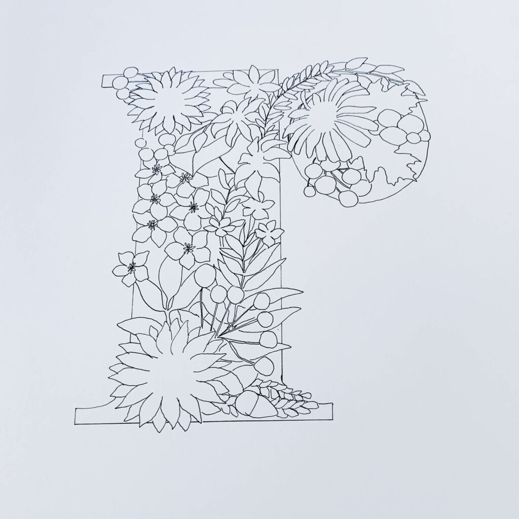
For this project, I actually worked out my composition using the computer, placing the floral elements over the letter and filling out the space. This is what in the long term cut out a lot of time for me and made it possible to complete the whole project faster than I had anticipated. I also worked in blocks creating four or five letters at a time.
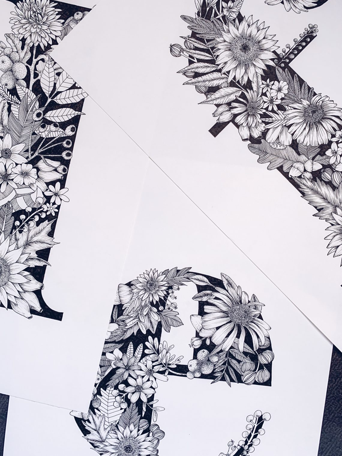
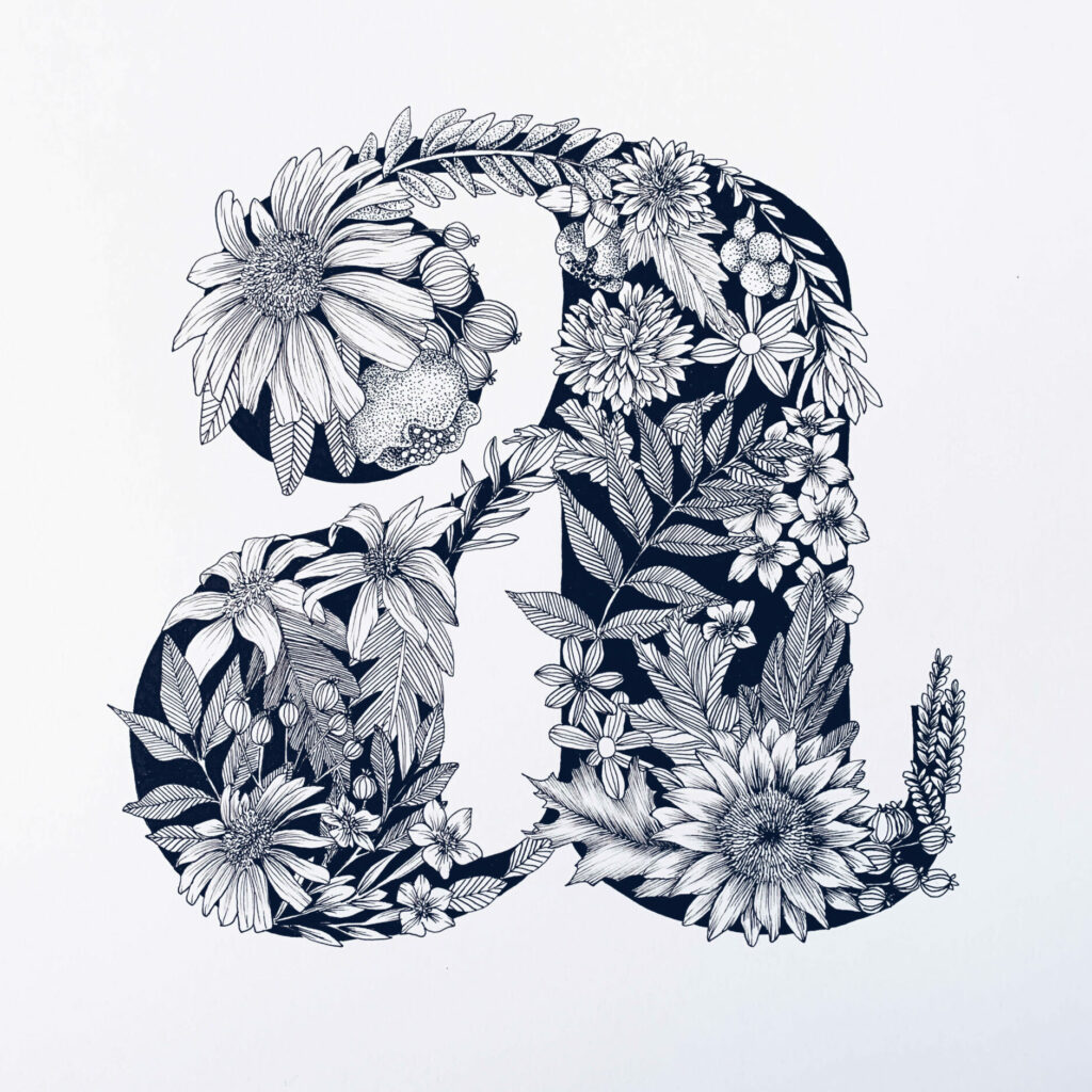
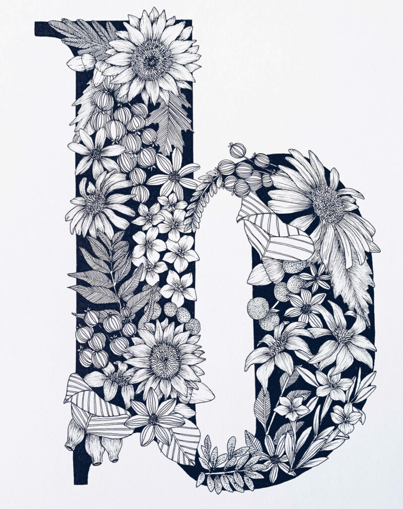
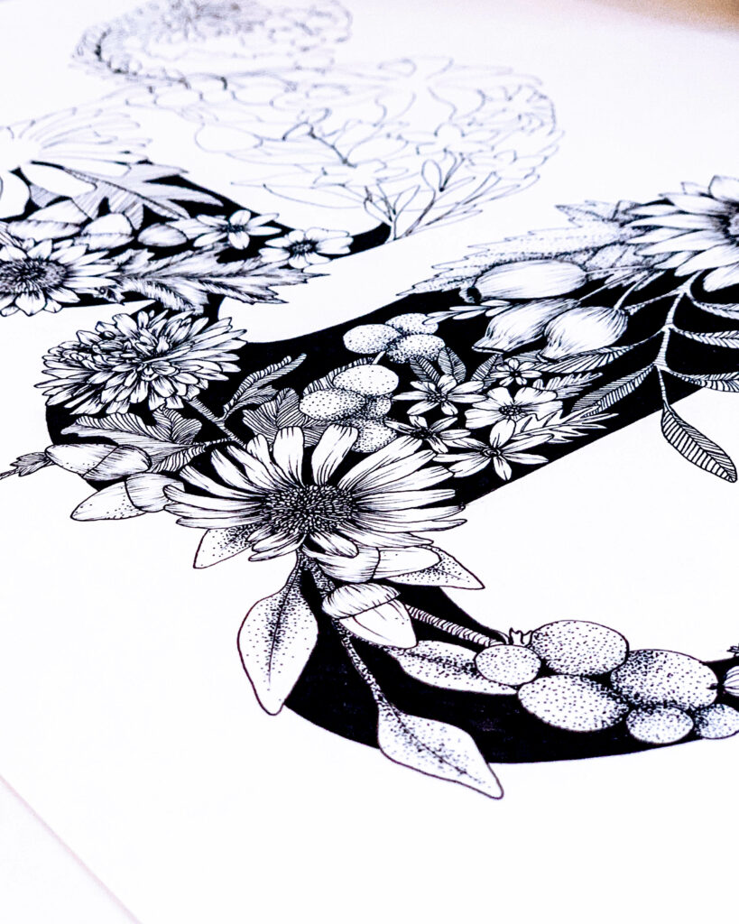
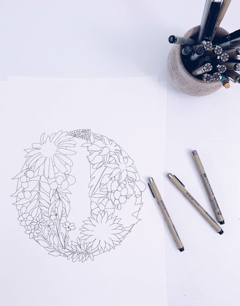
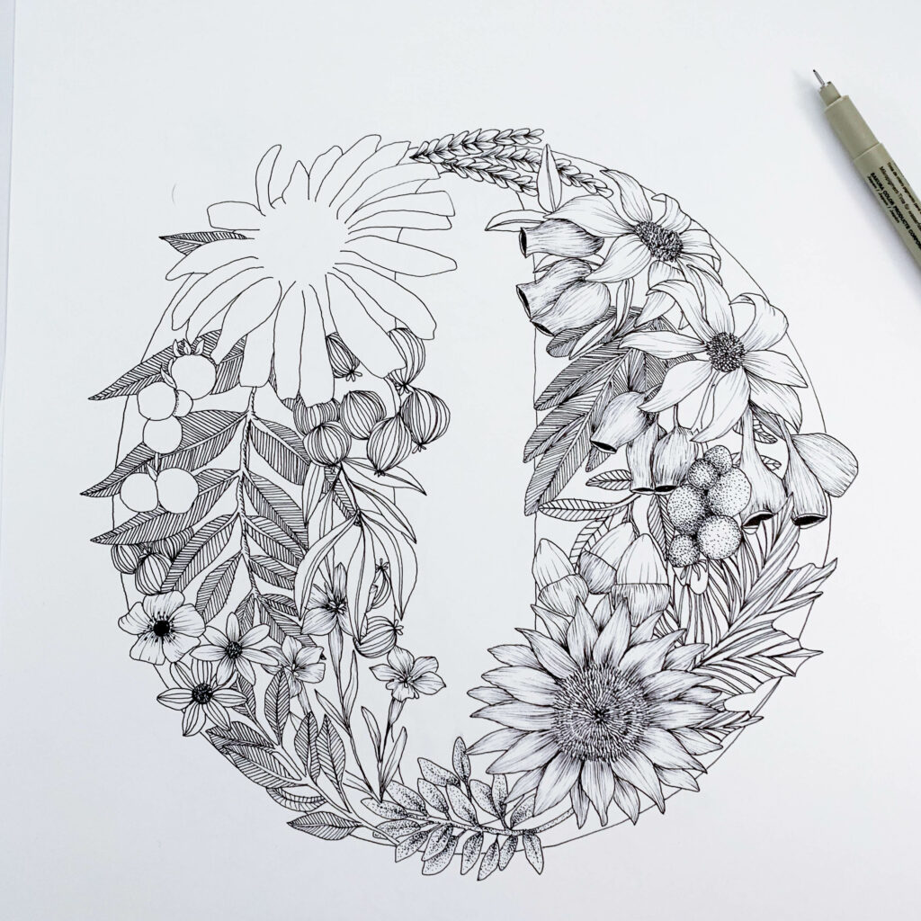
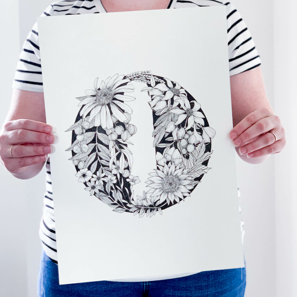
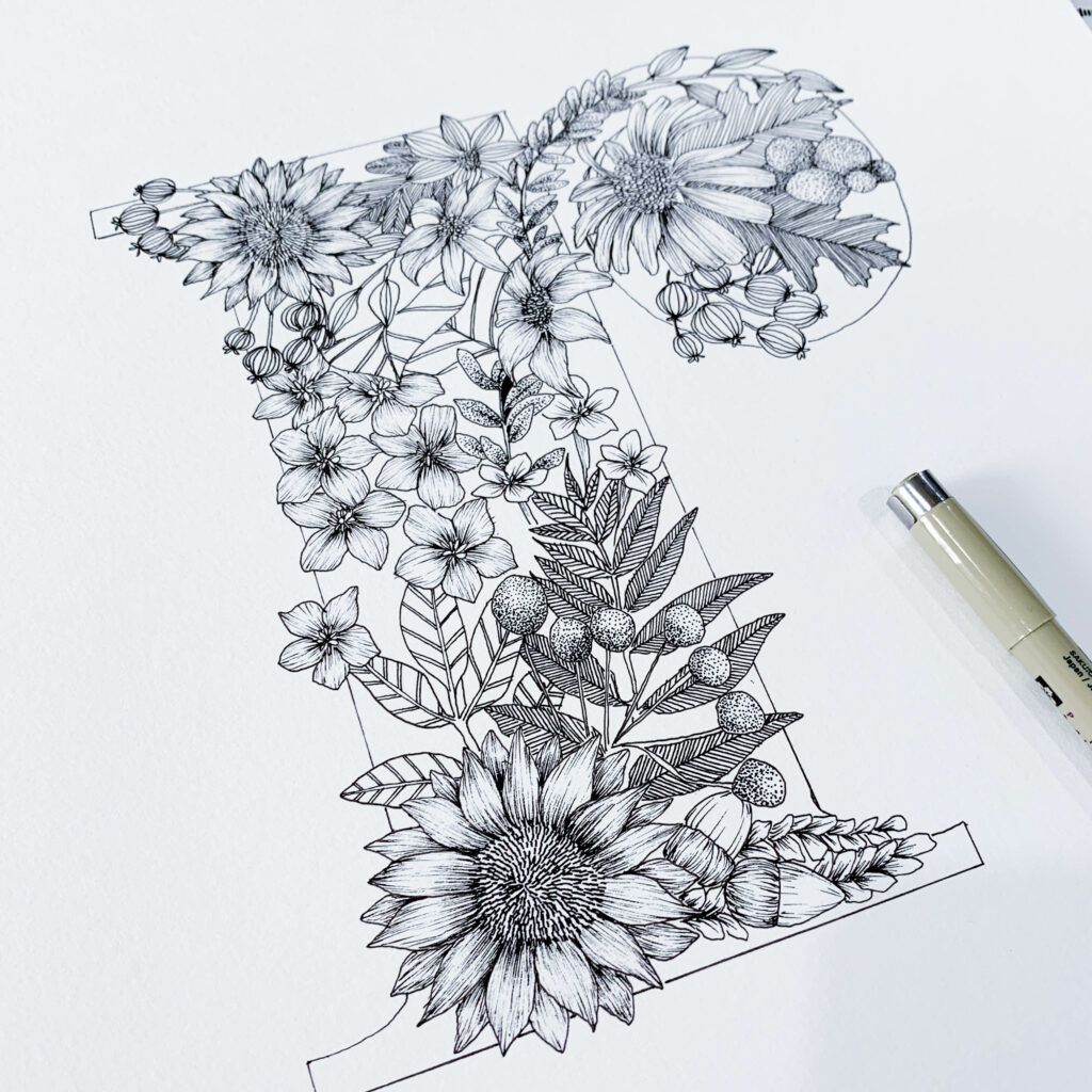
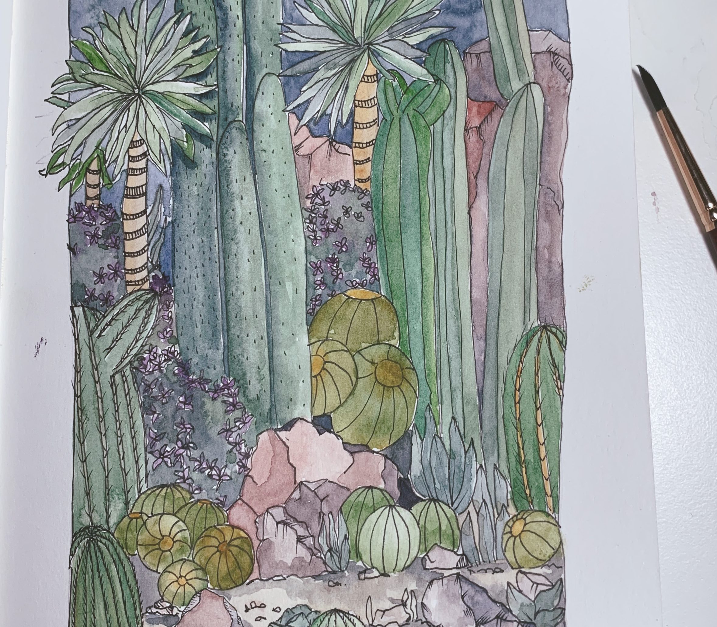
Once I was relatively happy with the design, I printed it and used tracing paper to finalise the outline and composition. At this point, I was still able to alter or add elements where I felt the design needed a little extra depth or if there was too much empty space that needed filling out. With a finalised design, I then traced onto paper (I used 200/gsm cartridge drawing paper) using a size 01 Micron Pen for the outline.
The last stage (and my favourite stage) was to fill in the detail with patterns, line work or stippling to create depth and interest. This is where a letter came to life! For me, it was the most relaxing and therapeutic stage. I could switch off from the world around me and get lost in the creative world of flowers and letters.
There you have it! A peek inside the process of how I created this alphabet and the reason behind creating it. A creative outlet to keep my creative momentum going continuously throughout the whole year. What will be my challenge for this year?
You May Also Like